US covid-19 deaths have risen, peaked and fallen very differently from those of large Western European countries.
What is causing this difference and what can we learn from it?
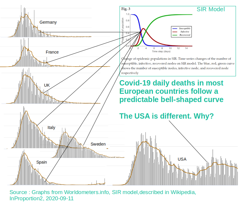
Why is the US different?
In the larger countries of Western Europe the scale of death tolls has varied significantly, but the shape of the mortality curve has not. In most of Western Europe, covid-19 deaths have risen and fallen around a single peak in a familiar bell-shaped curve.
As shown in the above image, covid-19 mortality curves for Europe are very similar to the curve predicted by the so-called 'SIR Model'. SIR, developed by Scottish scientists Kermack and McKendrick in the 1920s and 1930s, is a mathematical model used to predict the path of a number of different infectious diseases. [1] Notice how the curve rises slightly more steeply than it declines in both the SIR model and the covid data. The similarity between this decades-old mathematical model and 2020 covid mortality curves is striking. This observation suggests a natural process and not one resulting mainly from human interventions.
Notice however that the US covid-19 mortality curve does not follow the pattern of these European countries and by extension the SIR model. Why is the US different?
The US covid mortality curve is a composite of regional variations
Many have observed that the southern US is having a very different covid experience from the north. A reasonable hypothesis is that the US mortality curve is a composite of other curves, one overlaying the other to give the overall curve. A possible explanation for the varying forms of the underlying curves could be related to regional and climactic differences.
Dividing up the map and looking for differing mortality patterns
In this study by InProportion2, mortality data was initially extracted for the contiguous US (the mainland excluding Alaska) according to the Köppen climate classification[2] for each administrative district within each state. Looking for a pattern linking mortality curves to the Köppen climate zone in this way did not provide a clear result.
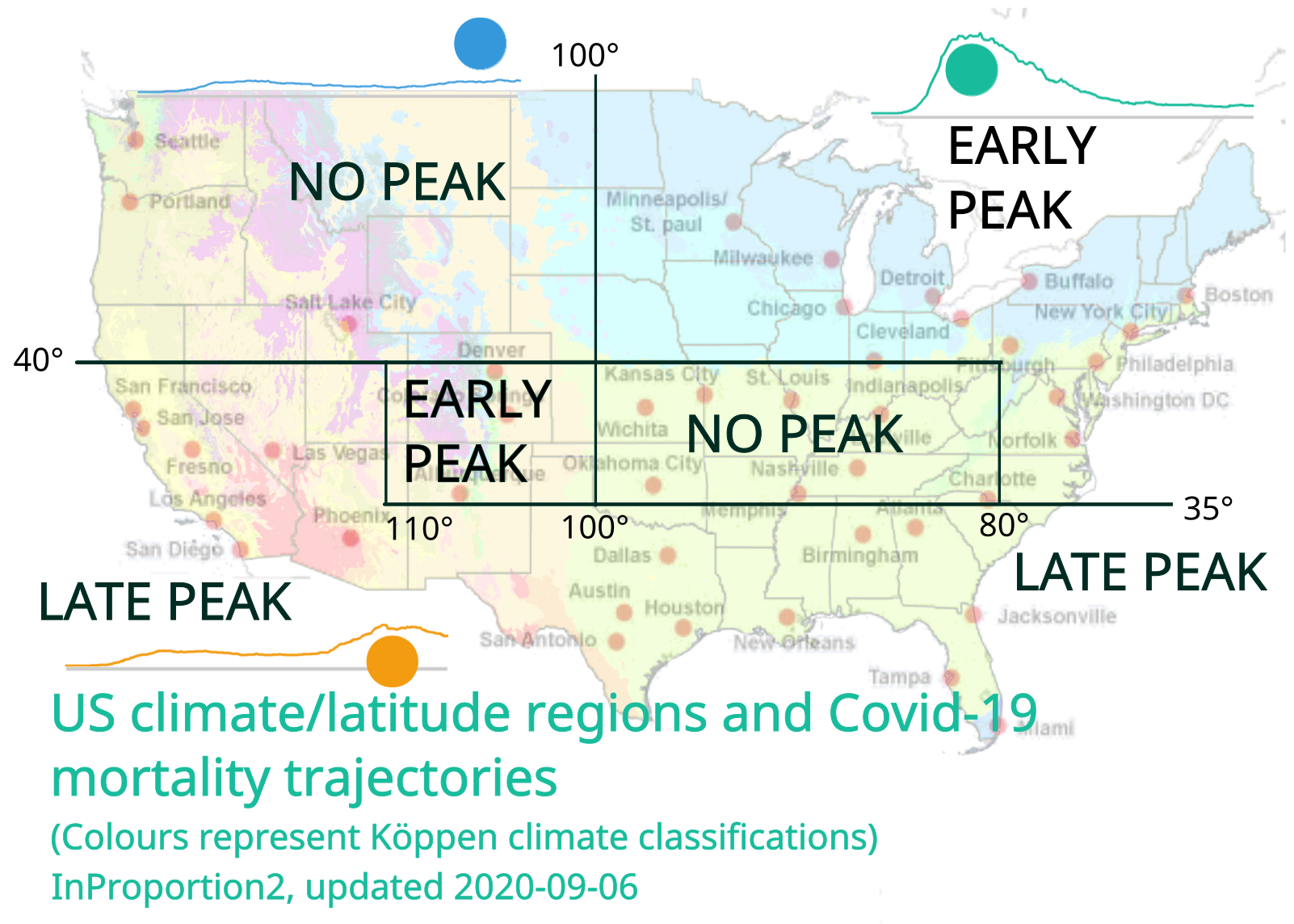
In a further iteration, the map was then divided into a grid so that differing climate zones could be considered in conjunction with latitude. It was found that covid mortality data for these smaller zones followed one of three distinct patterns. Once these smaller zones were identified, they could then be grouped into larger zones sharing the same overall mortality pattern (the smaller zones are shown in Notes on 'Method' below.[3]
The three patterns observed are as follows:
-
EARLY PEAK - predominantly in Northeastern and North Central US. Areas encompassing Minnesota and Pennsylvania have mortality data resembling the bell curves seen for a number of West European countries.
-
LATE PEAK - predominantly in the South and Southwestern US. In places such as California and Florida, covid deaths peaked later and lower than regions to the North.
-
NO PEAK - in the Northwest and southern Midwest, and more northern reaches of the South, states such as Oregon and Kentucky had a relatively low level of covid deaths and overall, no clear peak in deaths.
The three patterns that occur in five zones are shown on the map below together with the defining degrees of latitude and longitude (the faint colours on the map indicate the Köppen climate zones):
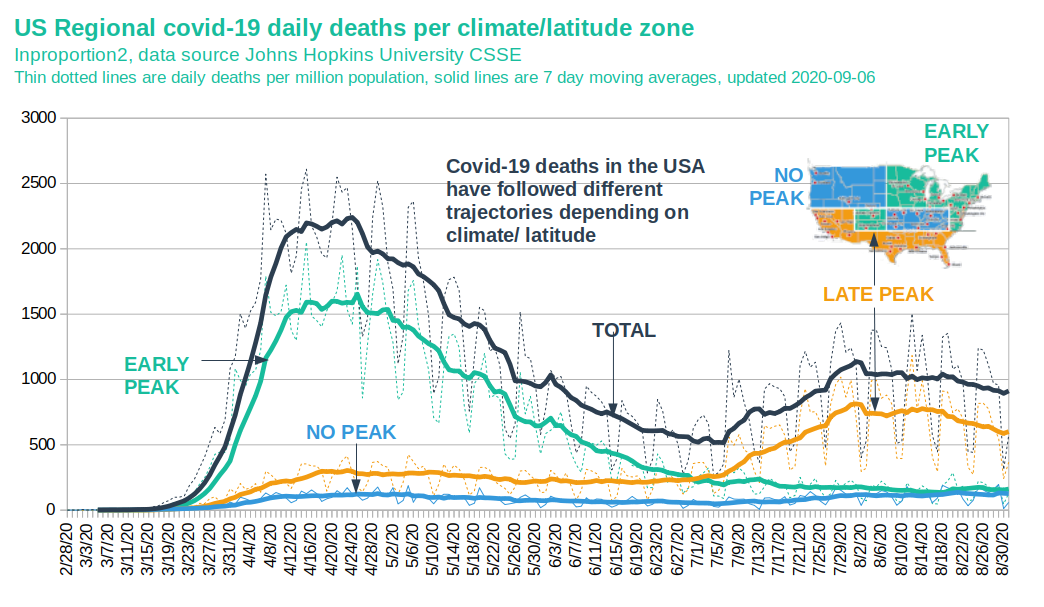
Daily deaths for the three zones are plotted in the following chart. Note that the dark blue line represents the total number of deaths for continental USA, excluding Alaska:
Conclusion 1:
2020 Covid-19 mortality trajectories in the US follow three distinct patterns:
| Climate/Latitude Region | Apparent Peak Month (2020) |
Max Deaths/Day (Rolling Average) |
Approx Population (Millions) |
Covid-19 Deaths (Thousands) |
Covid-19 Deaths per Million Population |
|---|---|---|---|---|---|
| EARLY PEAK | APRIL | more than 2000 | 132 | 100 | 752 |
| LATE PEAK | AUGUST | less than 1000 | 130 | 61 | 465 |
| NO PEAK | NONE | less than 200 | 63 | 15 | 230 |
(Covid-19 deaths counted to 2020-08-31)
What was the impact of lockdowns and quarantines?
The covid outcomes for the three climate/latitude zones identified are significantly different as regards timing and magnitude. How did interventions such as lockdowns and quarantines impact the rise and fall of covid deaths?
Strictness of interventions has been recorded in Oxford University's 'Coronavirus Government Response Tracker'. The tracker records a 'stringency index' score to reflect the stringency of interventions of various types such as school and workplace closures and stay at home requirements.[4]
The stringency index is given for each state, presenting a challenge when attempting to correlate with the climate/latitude zones, which sometimes straddle more than one zone. Utah, for example, encompasses all three climate/latitude zones within its borders.
To deal with this, states were allocated to zones where it was reasonably clear that the majority of the population resided in that zone. States that did not clearly belong to one of the zones were excluded, and are shown in grey on the following map.
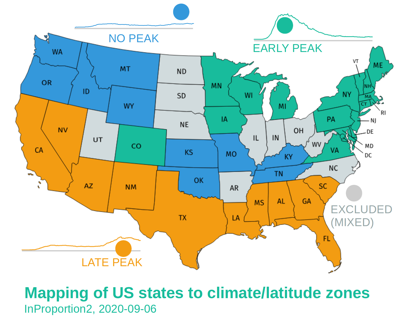
Once the climate/latitude zones were mapped to states, it was possible to plot the covid mortality curves together with the stringency index averaged for those states. The following chart shows the result. The dotted lines reveal how the stringency index peaked in each of the regions with a value of 65 to 70 in mid-April. While stringency rose and fell in a similar way across each region, covid mortality behaved differently for each zone.
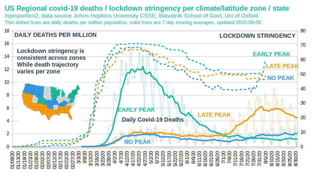
We can see in the above chart that overall approaches to lockdowns and quarantines were on average similar in stringency and peaked at the same time in mid-April in all of the climate/latitude zones. This contrasts with the covid mortality trajectories, which are quite different in each of the three zone types. Deaths in LATE PEAK for example peaked at only half the level of those in EARLY PEAK, with the peaks occurring four months apart.
The NO PEAK zone, although having the same intervention stringency as the other zones, had much lower levels of mortality and no comparable peak. (The above chart shows deaths per million population to facilitate the comparison.)
Conclusion 2:
Covid deaths have risen and fallen over time in a way which correlates with climate/latitude zone rather than with the scope and timing of interventions.
The effect of quarantines and lockdowns in the US on the rise and fall of covid deaths appear insignificant compared to the effect of climate and latitude.
The above is an effort to understand the path that Covid has taken in the US. While climate/latitude zones identified above are the original work of InProportion2, the idea that regional differences could be important to understanding a respiratory disease such as covid of course is not. In fact, some were drawing attention to this decades ago.
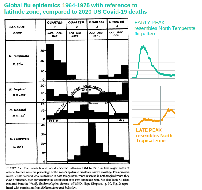
The following image is based on an extract from R. Edgar Hope-Simpson's book The Transmission of Epidemic Influenza published in 1992.[] This shows that nearly thirty years ago, data was available and the connection was made linking latitude and the spread of a respiratory virus.
Notice in the below image how in temperate climes, flu infections resemble the EARLY PEAK zone, with infections peaking higher and sooner than tropical zones, which resemble the LATE PEAK zone, following a lower but more sustained shape.
Conclusion 3:
The time of year together with climate and latitude appear to be significant factors determining the nature and outcome of covid-19 outbreaks in the US.
The stringent interventions across the US may only have had a minor impact, if any, on the trajectory of covid-19 in 2020.
![]()
Sources and notes:
-
[1] Wikipedia / Compartmental models in epidemiology / The SIR model
-
[2] The Köppen climate classification separates climates into five main climate groups, with each group being divided based on seasonal precipitation and temperature patterns. Wikipedia
-
[3] Notes on 'Method'
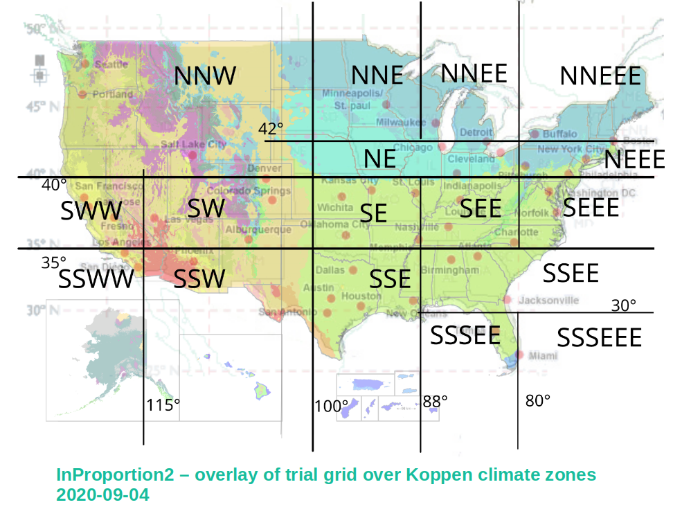
- This image shows the smaller regions distinguished in an interim step in order to identify commonalities in mortality data. In a later iteration, the grid at 115° longitude was moved eastwards. Alaska as well as territories not in the continental US have only a very small proportion of overall mortality numbers and were excluded from this study.
-
Mortality data was sourced from the COVID-19 Data Repository by the Center for Systems Science and Engineering (CSSE) at Johns Hopkins University. https://github.com/CSSEGISandData/COVID-19
-
Latitude and longitude coordinates in mortality data were linked to Köppen climate codes using the data provided by Hans W. Chen of Lund University http://hanschen.org/koppen/
-
[4] Blavatnik School of Government, University of Oxford
-
See also report Variation in US states’ responses to COVID-19, 06 August 2020
-
The categories of interventions used:
-
School closing
-
Workplace
-
Cancel public events
-
Restrictions on gathering size
-
Close public transport
-
Stay at home requirements
-
Restrictions on internal movement
-
Restrictions on international travel
-
[5] The transmission of epidemic influenza / R. Edgar Hope-Simpson, Springer Science+Business Media, LLC, 1992 - Hat tip to Ivor Cummins (aka the @FatEmperor).