The UK remains in lockdown because, according to the Government, more than a thousand new cases of Covid are being found each day.
As recently as 10 June, Chief Medical Officer Chris Whitty said that we are still in the middle of a pandemic and "Covid-19 is a very long way from finished".
Covid infection trend as reported by the Government
Here is a chart presented during the Downing Street press conference on 12 June.
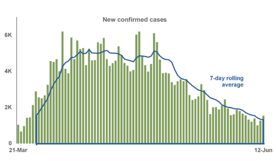
Trends in new Covid cases as presented by the UK Government 12 June
Covid infection trend as reported by the National Audit Office (NAO)
On 12 June the National Audit Office published a report looking at NHS preparedness [3] and included the following chart, also showing the trends in new Covid cases. On a superficial inspection these Government and NAO charts may appear roughly similar, a bell shaped curve rising and falling - but look closer.
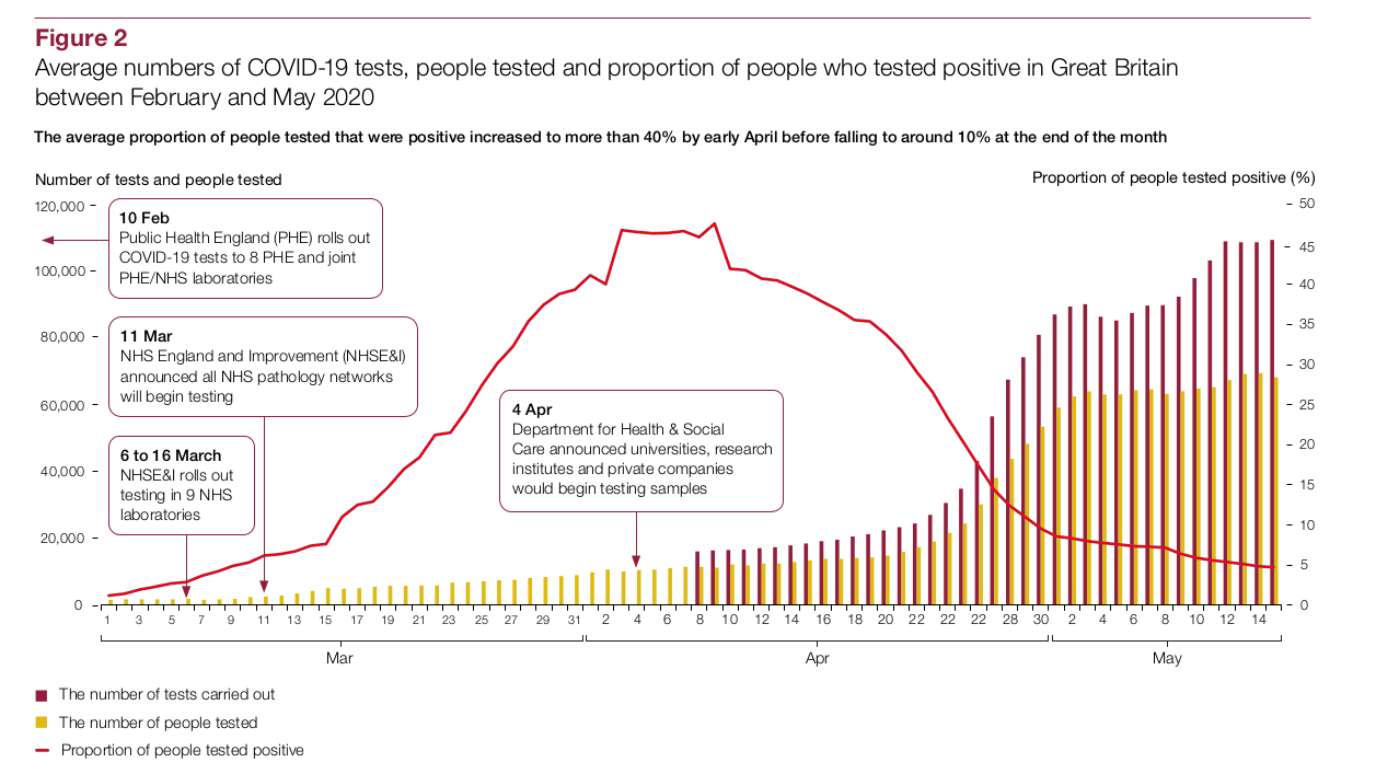
Trends in new Covid cases as reported by National Audit Office 12 June
You might think the NAO chart (red line) looks slightly more optimistic as it is trending down closer to zero compared to the Government's blue line, but there are more important differences. The NAO chart presents the proportion of people who test positive while Government shows just the number of positive results. (the NAO chart indicates the number of tests being done with the bars that you can see growing to the right).
Of course the more you test, the more you positives you will find.
If you were testing the sea for saltiness, you would report the proportion of salt to water in grams per litre or similar - not the simple quantity of salt collected.
Furthermore the actual number of people infected will never be known unless you continually test the whole population. For this reason, the raw number of new cases is far less interesting than the trend in new cases.
When the NAO reports the trends in Covid cases they of course use the proportion rather than the raw number. This gives a very different picture from the Government's, especially if you pay attention to the dates.
Government trend superimposed on the NAO Trend
In the following image I have superimposed the Government chart on top of the NAO chart to compare the shapes. by aligning the dates on both data series. The difference is striking.
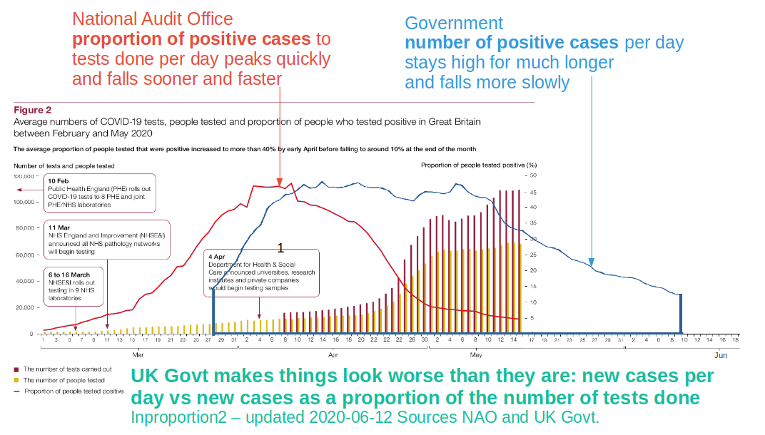
The Government continues to unnecessarily elevate fears of the Coronavirus by presenting raw numbers of new cases without taking into account the rising number of tests being performed.
Notes and sources: